Let’s explore a bit what we can do with the elements on the Stèles, de Victor Segalen web site. I’m interested in seeing what the relationship between the original book and the web site can be, in terms of interaction, organization of the information, and general user experience.
What would make sense within a book is only links with “next/previous page” functionality. However, it’s quite clear that trying to emulate the behavior of a book, as in the Amazon look-inside-the-book tool, means just not making use of the specificities of the medium. No point in doing that: the web does not fully emulate a book, so constraining navigation to whatever subset of the paper behavior the web can mimick is quite pointless.
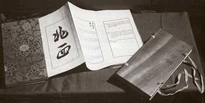
What’s more, this book was quite specific in its physical design: the front and back covers were small and thin sheets of wood, and the paper was folded inside in a Z shape, each poem on one fold.

So one could think of moving left and right (instead of flipping pages), or folding/unfolding the next fold.
Another issue is the “page” concept: in Segalen’s original, one single folded sheet of paper carried all the poems (on one side, the other side was blank). On the web, it would make no sense, even if it could technically be done (either as an enormous, old-fashioned, down-scrolling page, or as a stupid left-to-right-scrolling page (Central Saint Martins had such a page for a while).
In both cases, we’re looking at a definite choice made by the author (who arranged the smallest details of the printing of that first edition), that are part and parcel of the work. Putting this work on the web should be about both respecting the artistic intention and limiting the web work to all things not artistic, so that the artistic content comes only (or mainly) from the artist himself.
Dealing with poetry can be rather simple, in the case of poets who had someone print their works within the style of a publisher. Baudelaire cared about the words and their organization. In that case, font and layout are of no concern, within the boundaries of commonly understood neutrality.
An author may choose to use typographic effects, such as Apollinaire’s Calligrammes. Those may still be bound in whatever (neutral) form is possible.
Segalen adds another set of requirements: layout, paper, binding, etc. are part of the 1912 edition of Stèles. As such, when publishing a reprint as a paperback, the publisher betrays the work, by deciding which part is essential to the work, and which isn’t. You wouldn’t imagine an art book presenting the color swatches of Picasso’s paintings, after deciding that the colors are what makes a Picasso a Picasso, we’d percieve this as totally wrecking the artist’s work. On the other hand, we all accept paintings reproduced as high-quality prints of photos on glossy paper, we consider that the essence of the work is conveyed, albeit with a slight degradation.
The thin line between those two ends is defined in great part by the artist him/herself, and by custom. In our case, after printing himself a couple of really sophisticated runs, Segalen had his work published as a “regular” book, featuring only the black border, a set of chinese characters for each poem and a slightly unusual but straightforward pagination. [Note to self: must look up all publication dates and Segalen’s involvement in each–this is just guesswork.]
That way, the author provides us with his view of how the work may be adapted to the constraints of the output channel.
The question therefore evolves into: can we guess what the author would have chosen to retain of his original design, when dealing with web publication?
I’ll be working some more on this site in the next few days or weeks.
The site features the following elements:
- orientation
- poem
- page:
- bibliographie
- Victor Segalen (short biography)
- Présentation des Stèles
- Texte intégral (table of contents)
- thanks / news
- news item
Each orientation is defined by the following characteristics:
- sequence within the book
- next orientation
- first poem (uh??!)
- last poem (hmmm… that’s soooo clean–but I’m not touching the code now)
… from which we can derive the following navigation elements (the list also includes generally available elements):
- previous orientation
- next orientation
- first poem (next page)
- list of poems in this orientation
- previous orientation’s last poem (previous page)
- next orientation’s first poem
- table of contents
- other site pages
… while the current navigation scheme provides (skipping the Phase 4, sound, and contact links–those don’t play a significant role in it):
- previous orientation
- previous poem
- next poem
- next orientation
- table of content
Each poem is defined by the following dimensions:
- orientation
- Stèles face au Midi
- Stèles face au Nord
- Stèles orientées
- Stèles occidentées
- Stèles du bord du chemin
- Stèles du milieu
- sequence within the orientation
- sequence within the book
… from which we can derive the following navigation elements:
- orientation (previous page if first poem within orientation)
- previous orientation
- previous poem (previous page if not first poem)
- next poem (next page if not last poem)
- next orientation (next page if last poem)
- table of content
- other site pages
… while the current navigation scheme provides:
- orientation
- previous orientation
- previous poem
- next poem
- next orientation
- table of content